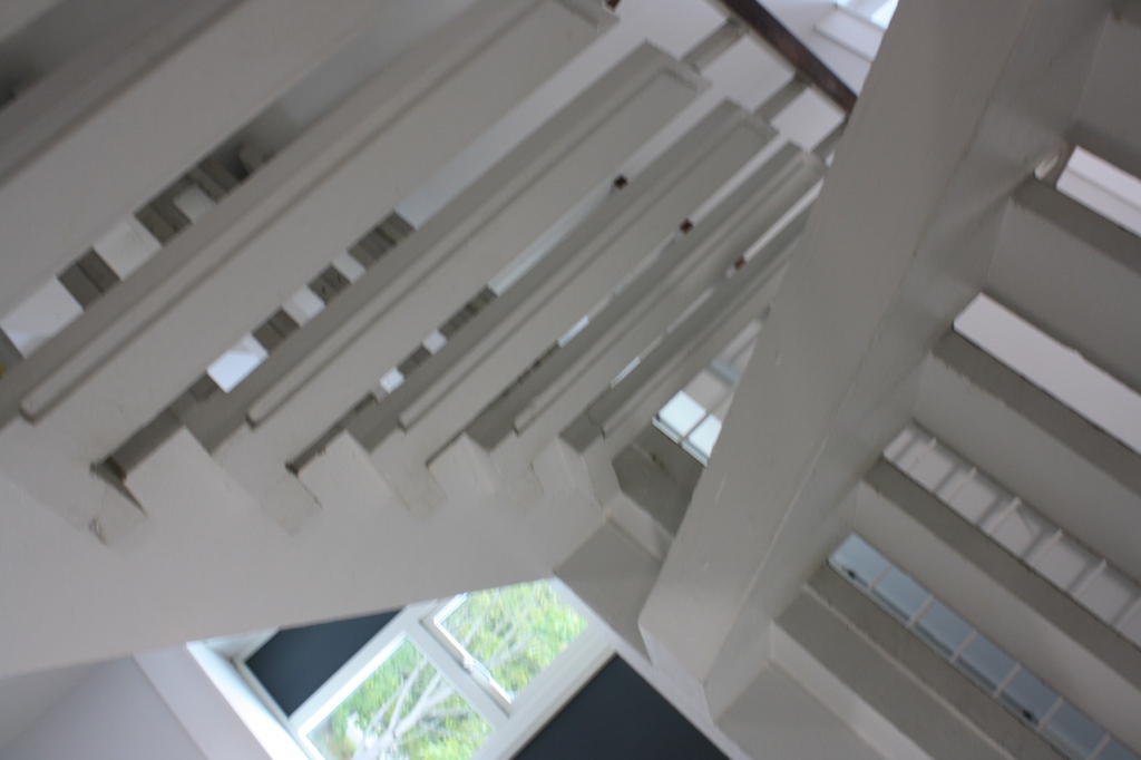
High Angle – Taken low looking up. This is the stairs going up. The lighting comes from out the window and a light on the side of the wall.

Low Angle – This is the stairs looking down. Lighting is realistic, that is what it looks like when you’re there. The picture looks split half way.

Dutch Angle – This looks like a photograph from a horror movie. The angle of the camera can make you uncomfortable. A villain could suddenly appear.
Rule of Thirds – The bins are a third into the composition.

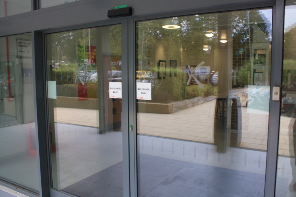
Eye Level Angle – Taken in front of my eyes. There is a reflection through the glass.
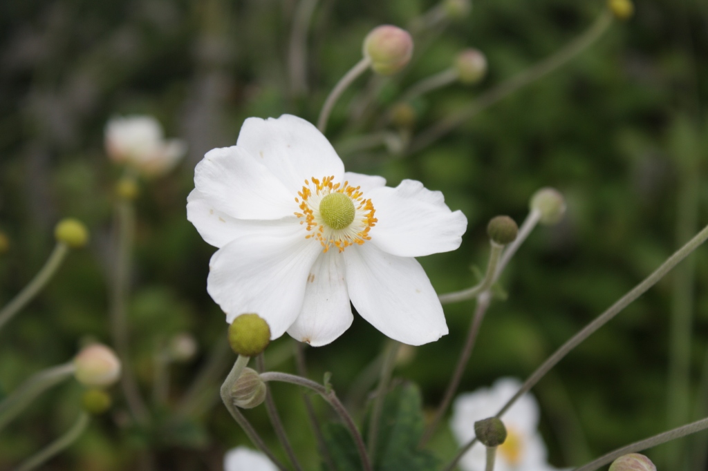
Dept of Field – I focused on the main subject which is a flower then made the background blurry.
Framing – Fareham college logo

Negative Space – the brick is the negative space of the red and green leaves. I like it because of the shape the leaves are in.

Balance – Someone else’s work with a good balance. There is a gap in the middle. The colours work well together.

